Logo Placement on a Pickleball Paddle: Where Designs Look Best

A custom paddle is only as good as its design execution. You can have the perfect logo, the perfect color palette, and the perfect concept, but if the pickleball paddle logo placement is off, the final product looks amateur instead of premium.
Paddle face logo design involves more than centering an image and hoping for the best. The shape of the paddle, the size of the graphic, and the position relative to the sweet spot all affect how the design reads in hand and on court. Here is a breakdown of where logos look best and which placements to avoid.
Understanding the Paddle Face as a Canvas
A paddle face is not a flat, uniform rectangle. The shape tapers, curves, and has structural features like edge guards and throat transitions that affect how graphics appear.
Working with the Shape
Every paddle shape, whether standard, elongated, or hybrid, creates a slightly different canvas. Your paddle branding placement needs to account for these structural realities.
- Standard shapes offer the widest central area for large, centered logos.
- Elongated paddles have a narrower face, which means designs need to be vertically oriented or scaled down to avoid crowding the edges.
- Edge guards frame the design. Leave at least a quarter-inch margin from the guard to prevent your logo from looking squeezed against the border.
Best Logo Positions on the Paddle Face
Certain positions on the face consistently produce the cleanest, most professional-looking results. A paddle face logo design that follows these guidelines will look intentional rather than dropped in.
Center Face: The Primary Position
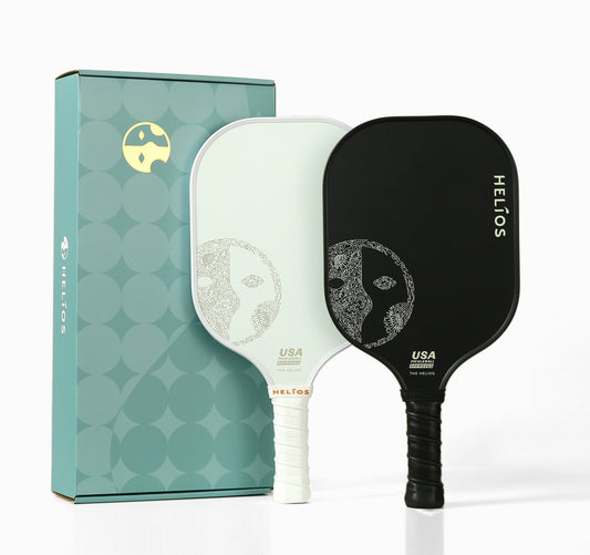
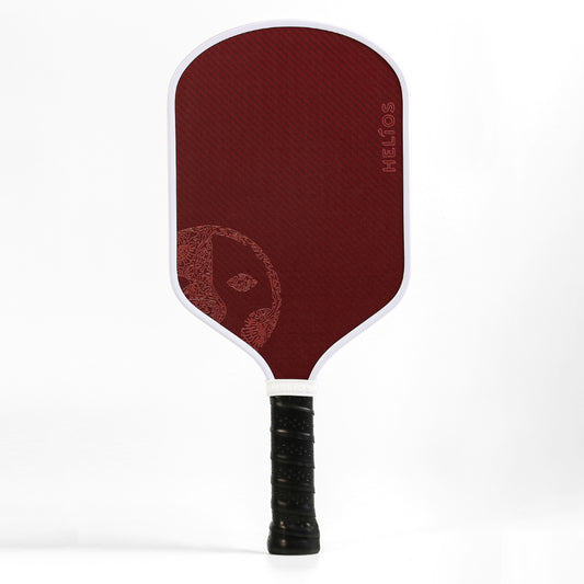
The center of the face is the most common and effective logo size pickleball paddle placement. A centered logo is visible from every angle, whether the paddle is in hand, leaning against a net post, or displayed in a pro shop. Keep the logo within the middle 60% of the face to avoid distortion near the tapered edges.
Upper Face: Brand-Forward Placement
Placing the logo in the upper third of the face puts the brand front and center when the paddle is held in a ready position. A smaller, secondary logo or tagline can sit below the main graphic. Upper placement works especially well for wide, horizontal logos.
Lower Face and Throat Area
The lower portion near the throat is a good spot for secondary elements like a website URL, a tagline, or a small icon. Avoid placing your primary logo here, as the hand and grip obscure the lower face during play.
Paddle Edge and Handle Branding
The face is not the only branding real estate on a paddle. A paddle edge logo, handle wraps, and butt caps all offer additional placement opportunities.
Edge Guard Logos
Printing a logo or text along the edge guard adds a subtle, premium detail that is visible when the paddle is viewed from the side. Edge branding works well for club names, short taglines, or small icons. Keep text legible at the small scale the edge requires.
Handle and Butt Cap
A small logo on the butt cap or a branded grip wrap adds a finishing touch that completes the custom look. Our custom paddle program supports branding across all these zones, giving you full control over the final presentation.
Design Tips for Maximum Impact
Smart paddle logo printing choices make the difference between a paddle that looks custom-made and one that looks like a sticker on a stock product.
Rules for Clean Execution
Follow these guidelines to ensure your design looks sharp on the finished paddle.
- Use vector files (.AI, .EPS, .SVG) for the cleanest reproduction. Raster images pixelate at larger print sizes.
- Limit your color palette. Two to four colors produce a bolder, more legible result than a full-color photograph.
- Contrast matters. A dark logo on a light face, or vice versa, reads clearly from across the court. Low-contrast combinations look muddy.
- Size appropriately. A logo that is too small gets lost on the face. A logo that is too large feels overwhelming. Aim for a graphic that fills 40-60% of the face width.
Not sure how your design will look? Our team provides a free mockup within 24 hours of receiving your files. Submit your design and see it on a paddle before committing to production.
Common Placement Mistakes
Even experienced designers make mistakes when working with a non-standard canvas like a paddle face.
What to Avoid
A few recurring errors show up across custom paddle orders.
- Crowding the edges: logos that run too close to the edge guard get visually clipped and look unfinished.
- Ignoring the sweet spot: Placing a logo exactly at the impact zone does not hurt performance, but ball marks will obscure the design faster in that area.
- Using too much text: a paddle face is not a billboard. Keep text to a brand name, a short tagline, or an event date. Sentences do not work at this scale.
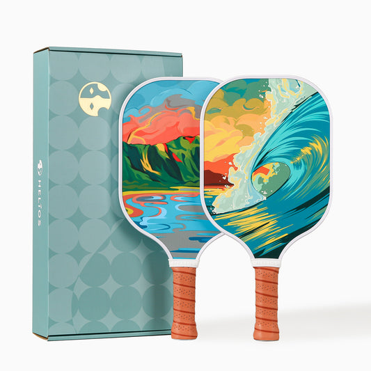
Helios paddles feature a Toray carbon fiber or fiberglass face that accepts vibrant, high-resolution printing. See our paddle lineup to understand the canvas you are working with.
Final Thoughts
Great paddle branding placement turns a custom order from "nice" into "impressive." Center your primary logo, leave clean margins, use high-contrast colors, and keep text minimal. Let the design breathe, and the paddle will speak for itself.
Ready to see your logo on a paddle? Start your free design consultation, and our team will handle the rest.
Frequently Asked Questions
Q. What is the best position for a logo on a pickleball paddle?
Center face placement is the most versatile and visually effective position. The logo stays visible whether the paddle is in hand, displayed, or photographed.
Q. Does logo placement affect paddle performance?
No. Modern paddle logo printing applies graphics to the surface without altering the paddle's weight, balance, or playability.
Q. What file format should I use for my paddle logo?
Vector files (.AI, .EPS, .SVG) produce the sharpest results. High-resolution .PNG files at 300 DPI or above also work well for most paddle printing methods.
Q. Can I place a logo on the edge guard of the paddle?
Yes. Edge guard branding is available and adds a subtle, premium touch. Keep designs simple and legible at the small scale the edge requires.
Q. How large should my logo be on the paddle face?
A logo that fills 40-60% of the face width typically produces the cleanest result. Smaller logos get lost, while oversized logos overwhelm the design and crowd the edges.
Q. Can I preview my logo on the paddle before ordering?
Yes. Helios provides a free mockup within 24 hours of receiving your design files. Submit your request here to see your logo on a paddle before production begins.